04 / 06
UI Library
React component library shared by my team's applications at Siemens.
- Role
- Creator and maintainer
- Context
- Siemens
- Status
- Internal, in use
- React
- TypeScript
- Tailwind CSS
- Figma
- Storybook
- Package managers
01 Overview
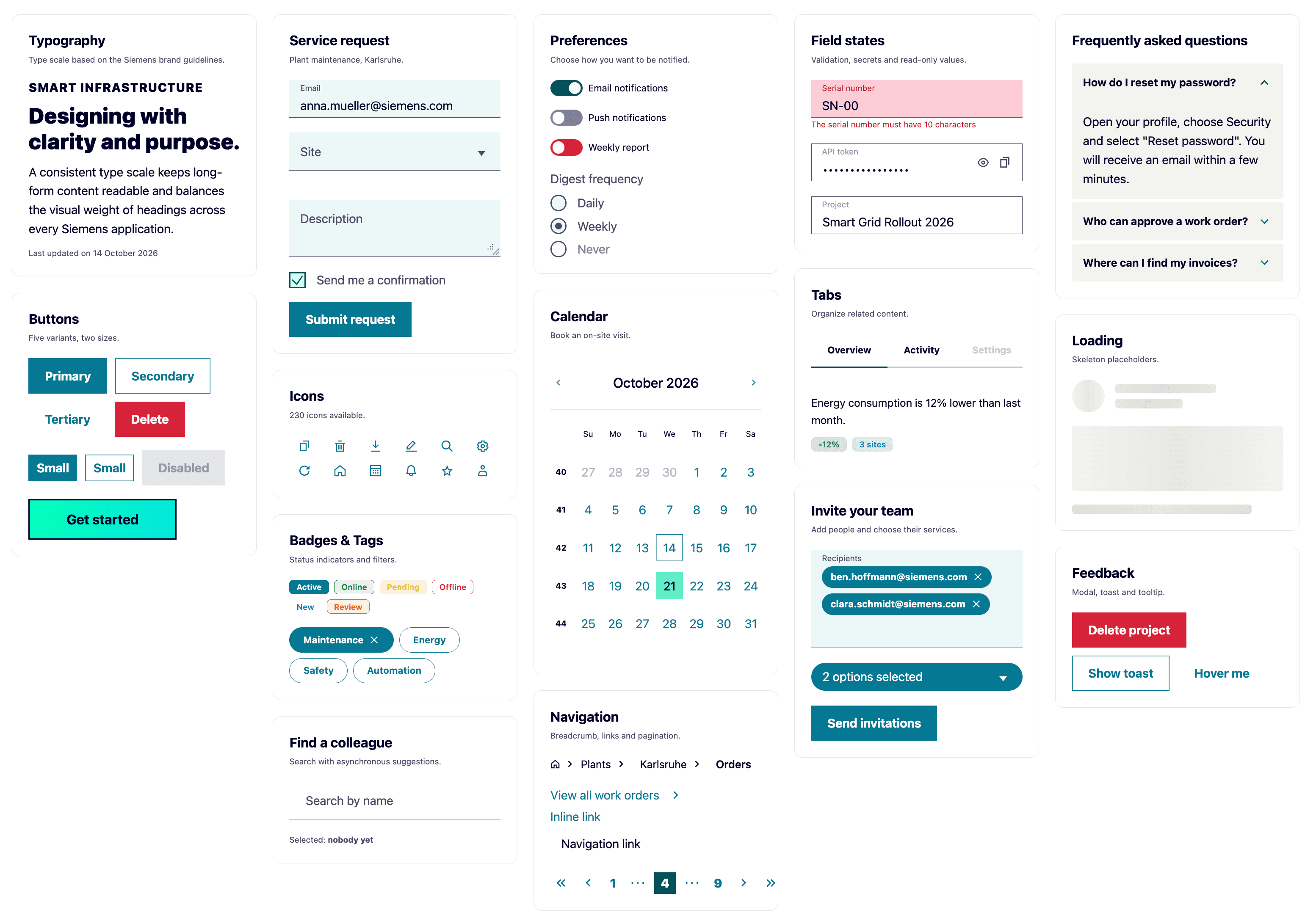
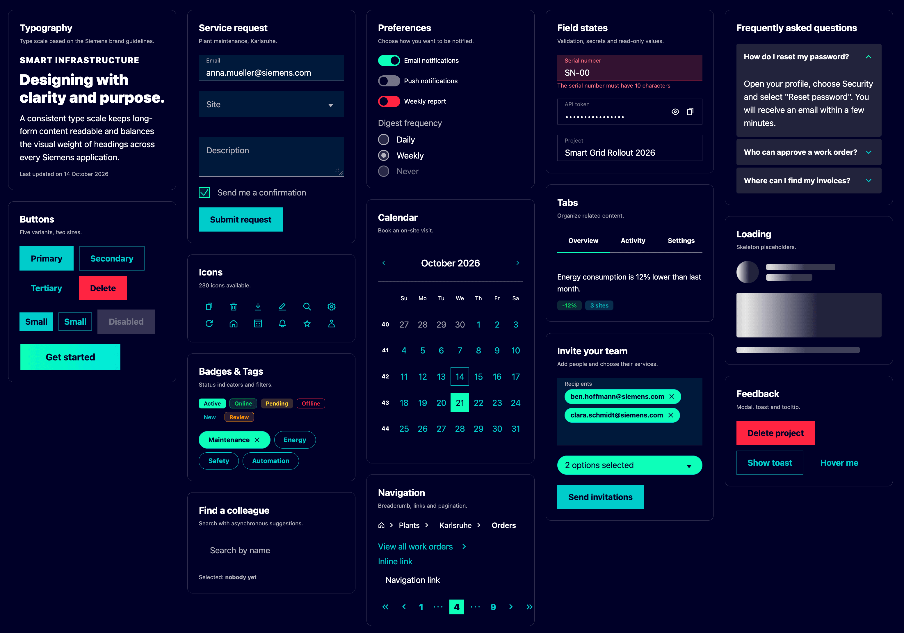
I created and maintain a React component library for my team at Siemens. Our applications share it, so forms, dialogs, navigation and feedback look and behave the same everywhere, follow the Siemens brand guidelines, and accessibility is handled once instead of in every app. Every component is documented in Storybook.
It goes from simple building blocks such as buttons, tags and tooltips to more complex and specific ones such as form fields with validation, date pickers and multi-select inputs. Integration tests run against the components to keep them reliable. The Siemens ID Integration Portal moved to it as part of its redesign.
02 Engineering challenges
- Building and testing the library thoroughly enough that any application can adopt it in its own environment, and that future updates stay easy.
- Packaging it properly, which means working with advanced package manager notions such as peer dependencies and version ranges, so consumers never end up with duplicated or conflicting installs.
- Auditing the dependencies regularly to catch known vulnerabilities and to keep up with updates.
- Handling major upgrades, like the move from Tailwind v3 to v4, which came with many breaking changes to absorb without breaking the applications that depend on the library.
Next project
DOMP